
Surfing through my facebook feed recently I came across this pie chart:
 Consider the numbers, each of which is different. Then consider the three pieces of pie, which are perfectly equally spaced. Obviously, this is fake news. And since the 2016 presidential election, I am on a crusade against bad, false data visuals being used for propaganda, by any political side of the spectrum.
Fixing fake news
So I needed to fix the fake news. And to do so, first I just fixed the graphic to match their data.

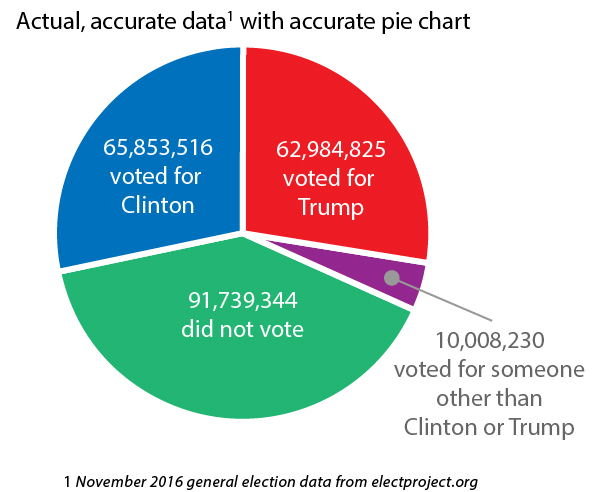
Then, of course, I wondered if the data was any good. I could find a source for their data and one wasn’t listed (propaganda indicator #1). So I found a reliable data source that provided a spreadsheet of all the 2016 general election data. The accurate pie chart with real election numbers:

Interestingly, if the original creator of this pie chart, had used real data the original intent — to encourage voters who are unhappy with the current political landscape to “start to give a shit” — would have been better served. The real data asks a number of important stories for voters.
- What would make those 91 million voters give a shit?
- Would the 10 million votes for other candidates have made a difference in the electoral vote?
- Who are those who don’t give a shit?
Inspiring people to look for more, to engage more deeply, to go beyond the surface is what information design is supposed to do. Using pseudo-graphics to falsely sway people or rile them up is the worst kind of propaganda.
And that is even worse than using a pie chart in the first place.


