
A recent article on Visual Loop had some excellent examples of cartographic visualization. It’s exciting to see so many exciting examples of cartography visualization and so many new tools being developed that increase our options for mapping data. I am especially interested in looking at data on maps in two ways, looking at non-traditional kinds of data mapped to geography and maps that take into account large data sets and make new insights possible.
Non-traditional data mapped to geography.
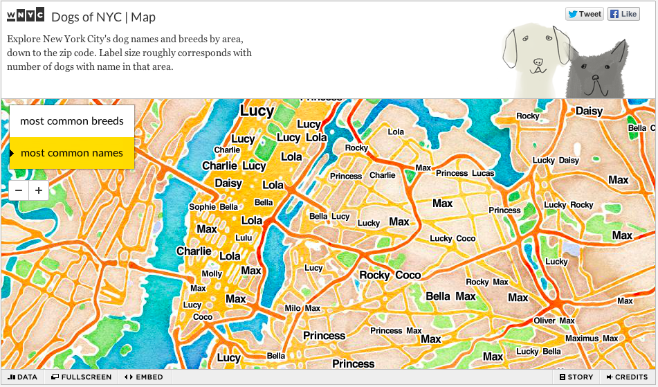
There are many examples of fun data maps, like the Dogs of NYC map that uses licensing data to map dog breeds and (more interestingly) dog names to New York. It’s a fascinating look at the dog population and makes me wonder at the popularity of Lola as a dog’s name on the east side.
Another fascinating look at non-traditional data is the Information Imbalance: Africa on Wikipedia map created by Ralph Straumann, Mark Graham, Bernie Hogan, Ahmed Medhat, Oxford Internet Institute. Here countries in Africa are sized proportioned to the number of Wikipedia articles on that country. As they note, Africa has 2.6% of articles on Wikipedia despite having 14% of the population and 20% of the world’s land. The immediacy of the visual comparison and the ease of interactions are both noteworthy visualization successes.
I also enjoyed the New York Time’s Bansky Takes New York map. As a big fan of Banksy and not being in New York at the time, I appreciate seeing the treasure map of his work there. Following his Instagram feed, while fun, did not give the scope of the terrain he covered in October.
Large data sets and maps
The Twin Cities Data Visualization Meet up has a fair share of geographers and cartographers in our mix and we consider a good number of cartography visualizations. We had an excellent presentation by the Minnesota Housing Finance Agency on their Minnesota Housing Community Profiles Map, a map that draws on a large number of data sets to create a resource for communities that need more affordable housing. I believe it is having an impact guiding investment decisions.
I love what the Smithsonian is doing with their interactive maps that compare historical maps to modern day. In this map, they compare New York City of 1836 to today.
And last but not lease is the New York Time’s latest story on Bloomberg Reshaping New York which takes data mapping to a whole new level. Combining cartography, photography and storytelling like this is the wave of the future. I would really love to tell brand stories in this way.
Button Text

