
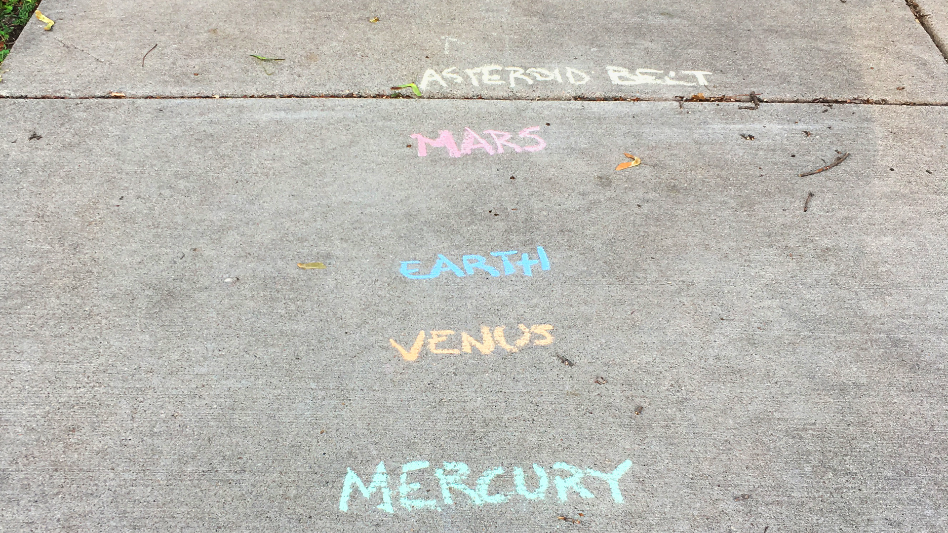
It’s a great day when you are out for a walk and on your way, you literally stumble upon a data visualization. This week, I found a solar system data visualization written in chalk on a sidewalk in Minneapolis. Someone had written out the name of each of the planets and asteroid belts of our solar system on the sidewalk in proportional distance from each other.
I don’t know who the designer of this information visualization was, but I imagine he or she was trying to help people understand the vast scale of our solar system in the best way possible—by having to walk down the block to get to the planet Pluto. It is a wonderful example of information design in the real world.
Having to experience the scale of distance between planets while experiencing the scale of my own neighborhood was a moment of joy that really made my day. Thank you!


